Is Nuclear Energy going the way of the Concorde?

concorde

They don’t exist unless they make money. Some people don’t like that idea, but that’s a fact of life, they are there to make money. And if they are making a product that doesn’t make them money, they’ll either stop making it or they’ll go out of business. Or both, you never know.

This is a quote from Bob Van der Linden, Curator of Air Transportation at the National Air and Space Museum, talking about supersonic transport. I fear it’s just as applicable to nuclear energy.

I’ve always been interested in flight (I actually started college as an Aerospace Engineering major), and to me, the Concorde represents an amazing feat of engineering. Vox came out with a video last year on the death of the Concorde, which I really recommend that everyone watch. But listening to the video, it really got me thinking about how the fate of the Concorde is similar to the situation nuclear energy is in.

I’m far from the first person to compare nuclear reactors to planes; in fact, just recently Michael Shellenberger of Environmental Progress proposed that the nuclear industry consolidate and standardize like Airbus or Boeing.

But let’s look at some of the similarities between nuclear reactors and the Concorde:
-both nuclear reactors and the Concorde program have/had huge upfront costs, in design and the cost of a unit,
-both technologies were developed in the 1950’s-1970’s, and both are technological marvels,
-both technologies have faced public protest,
-both technologies have had large, public disasters,
-both technologies are somewhat inflexible (at least as they were implemented),
-both technologies were effectively banned in certain places,
-both technologies required a highly technical staff for operation and maintenance,
-both technologies have cheaper competitors.

To expand on these last two points, when I say that the technologies are inflexible, what I mean is that nuclear reactors normally operate at 100% full power for 1.5 – 2 years straight before shutting down to refuel. Nuclear reactors can ramp up and down in power, but often don’t because it wouldn’t be economically advantageous, and because it puts extra stress and wear on the reactor. The Concorde only had a few set routes, and a set number of seats – if more people wanted to fly than were seats, those extra people were out of luck – in essence, the Concorde also operated at 100% full capacity every flight, because it wouldn’t make economic sense to do anything but that.

Both nuclear reactors and the Concorde have/had unique advantages over competitors. In the case of nuclear, the ability to operate constantly while emitting no greenhouse gas emissions; in the case of the Concorde, getting to Paris in 3.5 hours. However, they both have/had competitors; nuclear competes with fossil fuels and renewables, and the Concorde competed with subsonic (normal) airplanes.

In the Vox video mentioned above, Phil Edwards makes the case that the Concorde died because of:
1) public disasters mixed with fears of flying,
2) noise complaints (Ban the Boom protests),
3) limited market (only trans-Atlantic flights, not trans-Pacific, no routes over the US),
4) concerns about terrorism (9/11 caused a drop in airline travel),
5) lack of support (Airbus wasn’t going to support the Concorde fleet anymore, it was too old and too difficult to upgrade),
6) and the high price of flights (because of extremely high flight costs).

It’s easy to see the parallels to nuclear, public disasters and a fear of radiation, protests, having a limited market (the large size of current reactors limits them to near large population centers), concerns about terrorism, and the higher prices than fossil fuel competitors. And many of the existing commercial reactors which have closed have been for these reasons (in addition to repairs being too complex/costly).

Westinghouse will be filling for Chapter 11 bankruptcy next week, and while Westinghouse’s fate is far from sealed, this is a big blow to the nuclear community, and it does seems to signal that a different path might be needed for the future of nuclear.

Taking all of this together, it seems like the advice for the next generation of nuclear might be to:
-expand the potential market size by reducing the size of reactors,
-increase the flexibility of nuclear by operating multiple reactors at each site which can be turned on and off relatively quickly,
-find ways to reduce costs by learning while building many units.

In many ways, this is the path that Small Modular Reactor (SMR) designers like NuScale are taking. I think if they can keep the costs down, it has a good chance of working. And interestingly enough, there are also startups working on bringing back supersonic flight and they are taking a similar approach; smaller planes (45 seats vs. over 100 for the Concorde), and more of them, which potentially offer more flexibility and may cut down costs.

Hopefully nuclear reactors don’t go the way of the Concorde, a symbol of society taking another step back from technological innovation.

Photo from the Intrepid Sea, Air, & Space Museum Complex.

OLC Memo on Form and Legality of President Trump’s Executive Order

Last week, President Trump announced the Executive Order entitled: “PROTECTING THE NATION FROM FOREIGN TERRORIST ENTRY INTO THE UNITED STATES”.

The Office of Legal Counsel reviewed this order, and I submitted a Freedom of Information Act (FOIA) request on the OLC Memo attesting to the legality of the Executive Order.

Here is that Memo, and the response back from the Office of Legal Counsel.

Link to Memo

Link to Response Letter

Response from Lawrence, Sovacool, and Stirling and Statement of Article Withdrawal

Last month I wrote a response to a paper written by Dr. Andrew Lawrence, Dr. Benjamin Sovacool, and Dr. Andrew Stirling. If you haven’t read that, here is a link to that analysis and response. Since then, I have been in contact with some of the authors, and last week I received word that the authors have decided to withdraw their paper, partially based on my analysis of their paper. The full situation has also been written about in Retraction Watch.

Dr. Lawrence, Dr. Sovacool, and Dr. Stirling have written an “Authorial Statement of Article Withdrawal” and have also written a response to my analysis. It should be noted that throughout this process, Dr. Sovacool has been very open and accessible, and I’d like to thank him and the other authors for taking the time to review their work, and admit when a mistake has been made. Here is their response.

Response to Nicholas Thompson

https://thompson.energy/2016/10/12/a-response-to-lawrence-sovacool-and-stirling/

We thank Nicholas Thompson (NT) for his serious engagement with our paper. Below, we respond to the specific issues raised. We also refer to the statement of retraction posted in the journal Climate Policy. The bottom line is that, NT has in his main criticism done an elegant job of deconstructive analysis. We commend and congratulate him on it.

Problem 1: The math is incorrect.

Unfortunately, this is a valid criticism, and on two counts. Very embarrassingly, mistakes were made both in data input and analysis. One column of data was mistranscribed. In addition, some percentage changes were not calculated correctly with respect to the stated baseline but with respect to an earlier date. When these mistakes are corrected, NT is correct that these particular data do indeed show that nuclear states did make the greatest absolute emissions reductions compared to all other groups. These errors should never have happened. A more detailed background is given in the statement of retraction. We are proactively correcting reports.

We also plan on undertaking a new analysis with the correctly transcribed data, to be completed and shared soon.

Problem 2: The method is incorrect and Problem 5 no attempt to account for population.

As acknowledged above, the method was unfortunately implemented in a flawed way. But, contrary to NT’s assertion, it is not self-evident that the method itself was intrinsically deficient. Based as it is on comparisons across qualitatively different institutional and jurisdictional settings, it is not clear that any single given weighting factor (e.g.: per capita emissions; emissions per GDP; or emissions attributable to specific policies) would of itself necessarily constitute an unequivocal improvement in the analysis. One specific dimension of variation could be made more explicit, but only at the expense of obfuscating others. The purpose of this analysis was simply to perform an initial test on a widely received assumption. The possibility of further elaborations does not invalidate the initial design.

Problem 3: There is no justification for the starting year of analysis.

The decision to use 2005 as the baseline year was made in recognition of the highly dynamic nature of change in this field. To use an earlier year would have diluted the effects of more recent trends (and been unfavourable to the stated findings). To use a more recent year would have emphasized the most recent developments (and been more favourable to the stated findings). So the chosen framing is not arbitrary or contrived. It is rather that a more complete analysis would systematically display sensitivities to these divergent framings.

Problem 4: Statistical significance.

At no stage was our analysis intended or claimed to rest on statistical arguments. As this present exchange illustrates, the underlying categories for any analysis of this kind are too ambiguous and volatile to warrant undue confidence in any particular aggregated statistical constructs. To assert this would be misleading. Instead, our contribution was intended to challenge a widespread assumption about the supposed climate benefits of nuclear power. Again, we must acknowledge that the test was in this case poorly implemented.

Conclusion

In summary, NT is correct that our article contains flaws that invalidate the analysis. This is by far the most important issue in this exchange. On other aspects of NTs critique, the position is more ambivalent. But it is certainly the case that analysis of this kind can be improved in ways prompted by NTs critique and discussed above, in order to yield more robust conclusions.

With respect to any implication of intentional bias towards renewable energy at the expense of nuclear power, we should like to stress that the errors described above were the result of honest mistakes. We hope that our unqualified acknowledgement of these errors here – and our proactive voluntary retraction of the article – insufficient to show that we are entirely open both to criticism and to different perspectives.

I do want to push back on a few things in this response:

1) As my original analysis showed, this methodology is somewhat arbitrary, and depending upon the time window that is chosen, will lead to different conclusions. Additionally, giving equal weight to extremely small and large countries can skew the data in different ways. If there is a new analysis down with the same methodology, I have concerns that it will fall prey to the same issues that came up in this paper.

But more importantly,

2) The authors don’t seem to deny that they have a bias against nuclear energy. I completely believe that any mistakes that were made in this paper were honest mistakes. But in this response, they state that their, “…contribution was intended to challenge a widespread assumption about the supposed climate benefits of nuclear power.

In this sentence, the authors seem to be saying that it is their belief that nuclear does not have climate benefits, or at least that was what they were trying to prove.

Most Life Cycle Analyses (LCA) of nuclear energy show that nuclear energy has relatively low life cycle emissions of greenhouse gases (meaning that over the life of that facility, from mining the materials, building the facility, operating the facility, to decommissioning it and disposition of waste, the total carbon emitted per energy produced is low). One of the most comprehensive studies of this was done by the National Renewables Energy Laboratory in the US, where hundreds of these LCA studies were reviewed, and the results were that nuclear emits about the same amount of greenhouse gases over its life, per power produced, as wind power does (median values for nuclear were 12-13 g CO2eq/kWh, wind was 11-12 g CO2eq/kWh, solar PV was 44 g CO2eq/kWh – for comparison, coal was 979 gCO2eq/kWh).

Nuclear energy, when done well, does produce low carbon energy – this isn’t an assumption, and the climate benefits are real, not “supposed”.

There is some great social science research about how people’s beliefs can actually impact their quantitative reasoning, and this even effects people who are very skilled at math (it can actually effect them worse!). This result was found by Dan Kahan, Ellen Peters, Erica Dawson, and Paul Slovic in 2013 (for a simple explanation, go here). This is why I completely believe these were honest mistakes in the Lawrence, Sovacool, and Stirling paper – because the authors of the paper probably found a result that seemed to reinforce an idea they had (that nuclear does not have climate benefits), and did not question the results.

All scientists should start any project by looking for an answer to a question, and not looking for information that backs up a previous belief.

A Response to Lawrence, Sovacool, and Stirling.

Introduction

A few months ago I read a paper, “Nuclear energy and path dependence in Europe’s ‘Energy union’: coherence or continued divergence?” and after reading it, I wasn’t sold. Their fundamental idea was that in countries which are looking to build nuclear or replace existing nuclear, emissions are not dropping as fast as emissions in countries which don’t have nuclear or are closing nuclear facilities, and that the changes in emissions were due to “path dependence”, meaning that once a country decides to go nuclear, they get stuck on that path.

The reason I wasn’t sold was there were a lot of words (21 pages), and three pages of references, but only one table that had any real data. That table showed a number of EU countries, how much their emissions had changed from 2005 and 2012, and the share of renewables in 2013 for that country. The change in emissions was presented in terms of percent reduction, without any data on absolute reduction in emissions, or the starting emissions for that country, and the growth of renewable generation also was not presented.

The data was also compared to 2005, which seemed odd considering the paper talked at length about the EU 2020 Strategy (which started in 2010, and uses 1990 as its baseline). It was also strange that in 2016, data from 2012 was being used instead of data from a more recent year.

So I emailed Dr. Sovacool and Dr. Lawrence (two of the authors) the following questions:

1) What time period was used for the emissions reductions? It seems to be 2005-2012, based on the 2015 EU Commission document page 30, but it’s not clear from the paper.

2) Why was 2005 used as the start of the period? The EU 2020 goes from 2010-2020, and the Lisbon Strategy went from 2000-2010.

3) Why are percentages of emissions reductions from countries with vastly different overall emissions averaged? Eg. France is a large energy producer and had significant cuts in emissions, Romania is relatively small in comparison, but both are weighted equally in the average of % emissions change. Why weren’t the total emissions changes for each group added up and then the percentage taken of that? This seems like a more accurate assessment of whether emissions increased or decreased in those groups of countries.

4) Likewise, why were percentages of renewables share averaged? Again, a small country (by energy consumption/population) with a large renewables share (eg. Iceland) has equal weight in this method to much larger country (eg. Italy).

5) Also, shouldn’t this column look at growth in renewables share over the same time period, not overall percentage? There are many European countries who’ve undergone a huge growth in renewable capacity, and a number that already had a large renewables capacity (eg. hydro) before this time period; if the goal is to identify the impacts of the EU 2020 Strategy, then the change in renewables generation would seem to be more valuable information, no?

I did get a response back from Dr. Sovacool, who said that Dr. Lawrence was on vacation, but he’d respond when he got back. And so I waited, and started to forget about the paper. I figure he probably lost track of my email, it happens.

But recently “The Sussex Energy Group” (Dr. Lawrence, Dr. Stirling, and Dr. Sovacool) has responded to a few other criticisms of this paper, and I read one of the responses. In it, they looked back at their data and realized that some of their numbers in the table from their paper were wrong, and they posted corrected numbers. At this point, I decided to do my own analysis, and here it is.

Analysis of Lawrence, Sovacool, & Stirling
Nicholas Thompson

There is a lot to unpack here, so I’ll try to go step by step.

Problem 1: The math is incorrect

Here The Sussex Group states that emissions reduction data was taken from the Statistical Handbook of the European Union, here is a link directly to that data. This data is presented in proportion to 1990 emissions, where 1990 = 100. What The Sussex Group seems to have done is subtracted the 2012 emissions from the 2005 emissions to get a “percent reduction in emissions”. This is incorrect math. To calculate a percent change of anything, you take (New-Original) *100/Original. By not doing this (dividing by the original value), they didn’t calculate percent change in emissions with a 2005 baseline (as the paper states).

To demonstrate, here is the data for two countries:

Table 1: Relative GHG Emissions Data for Spain and Hungary

1990 1995 2000 2005 2010 2011 2012 Subtracting 2012-2005 Actual Percent Emissions Reduction [%]
Spain 100 110.9 134.8 154.2 125.4 126.4 122.5 31.7 20.56
Hungary 100 81.3 79.5 80.6 69 67.2 63.7 16.9 20.97

Doing all this math correctly creates a different table than the one found here:

Table 2: Sussex Data vs. Calculated Percentage Reductions in Emissions

Sussex Data Corrected Percentage Reduction in Emissions
Group 1 Average 11.80 9.67
Austria 16.00 13.33
Cyprus 1.90 1.27
Denmark 17.50 18.54
Estonia -1.60 -3.49
Greece 22.60 17.61
Ireland 20.80 16.28
Italy 21.90 19.62
Latvia -0.40 -0.94
Luxembourg 10.80 9.97
Malta -9.50 -6.45
Portugal 29.80 20.59
Group 2 Average 13.77 12.07
Belgium 17.80 17.73
Germany 4.30 5.32
Netherlands 8.50 8.35
Slovenia 7.60 6.90
Spain 31.70 20.56
Sweden 12.70 13.60
Group 3 Average 10.19 12.92
Bulgaria 2.30 3.95
Czech Republic 7.10 9.54
Finland 9.90 10.10
France 12.10 11.91
Hungary 16.90 20.97
Romania 9.90 17.10
Slovakia 12.20 17.28
UK 11.10 12.53
Group 4 Average 1.50 3.32
Lithuania 3.40 7.11
Poland -0.40 -0.47

In The Sussex Group’s analysis, they split countries into four Groups:
Group 1: No Nuclear
Group 2: Decommissioned/Phasing Out Nuclear
Group 3: Plans to Extend/Replace/Add Nuclear
Group 4: Plans to Resume Nuclear

First note on this is even using their incorrect subtraction method, The Sussex Group data for Sweden and Latvia here is incorrect. The second note is that when using their premise and actually calculating the average percentage change in emissions correctly, their entire thesis is incorrect. It shows that countries with no nuclear had lower emissions reductions than countries which were decommissioning nuclear, and the greatest emissions reductions were in countries which were extending/replacing/adding nuclear.

Problem 2: The method is incorrect

So far, for the sake of argument, I’ve been assuming that method their analysis is correct – and it isn’t. Just averaging emissions changes in countries does not tell you much about the emissions changes in that group of countries, because each country has a different amount of emissions, and some of these countries are vastly different. Averaging a percentage change in emissions in Malta and Italy is meaningless – one has over a hundred times more emissions than the other. Taking a simple average weights these two countries the same, as if they are the same size.

Just to give an example, from 2005 to 2014, Italy reduced its emissions 27.2%, and over the same time period, Malta increased its emissions 2.1%. An average of these two would yield a 12.55% “decrease” in emissions – which is completely wrong! In absolute terms, Malta’s emissions increased 0.1 million tons of CO2-eq, and Italy’s emissions decreased by 160 million tons of CO2-eq. The proper way to calculate percent emissions reductions would be by summing the total emissions reductions for both countries over the time period desired, and dividing by the starting emissions of both countries (and multiplying by 100).

Problem 3: There is no justification for their starting year of analysis

Whenever anyone analyzes anything, the baseline they use is extremely important, and can influence the results. To demonstrate that, I’ve calculated and plotted in Figure 1 the actual percent emissions reductions for each of the 4 Groups that The Sussex Group looked at, as a function of the starting year, with 2014 being the end point. So for instance, on the graph, year 1995 is plotting the percentage emissions reductions for that group from 1995 to 2014. Data is from Eurostat here and here.

fig1
Figure 1: Percent Emissions Reductions by Group as a Function of Time

Just for a reminder:
Group 1: No Nuclear
Group 2: Decommissioned/Phasing Out Nuclear
Group 3: Plans to Extend/Replace/Add Nuclear
Group 4: Plans to Resume Nuclear

As the graph shows, with a starting year from 1990 to just after 2000, Group 3 had the most emissions reductions. Using a starting year after that, Group 1 had the most emissions reductions, but was closely followed by Group 3. This shows again, that their conclusion is not supported by the data. But that’s not all.

The paper also makes many references to the EU 2020 targets – which aim to decrease emissions 20% lower than 1990 levels. Based on that goal, it’s clear that 2005 should not be the baseline year, 1990 should. Meaning it’s countries in Groups 1 and 2 which have more work to do to decrease emissions, the countries which do not have nuclear or are decommissioning/phasing out nuclear.

Problem 4: Statistical significance

One of the groups shown here (Group 4) has only two countries, meaning there is likely little statistical significance from this group and no conclusions should be drawn from it. Normally samples are only statistically significant if there are 30 or more observations, which when it comes to countries is sometimes impossible. However the conclusions derived from the analysis in the paper don’t seem to address this limitation of this data.

Problem 5: There’s no attempt to account for population

Normally when comparing the carbon emissions of various countries, the total emissions are put in some context by putting them in terms of per capita emissions. I’ve done that here, for each Group (data here). Group per capita emissions data was calculated by summing the total emissions in each Group and dividing by the total population of each Group. As can be seen in the graph, Group 2 has the highest emissions to start with, followed by Group 1, 3, and 4. As time goes on, per capita emissions in Groups 1, 2, and 3 all drop, with emission for Groups 1 and 3 ending up almost exactly the same in 2014.

fig2
Figure 2: Per Capita Emissions by Group

Conclusion

The paper states the following,

“Perhaps most germane – and without necessarily implying causality – there appears to be a prima facie pattern among the disaggregated groups of countries presented above: namely, progress in both carbon emissions reduction and in adoption of renewables appears to be inversely related to the strength of continuing nuclear commitments.”

In the “Policy Relevance” section, the authors write that this article,

“…finds that intensities of national commitment to nuclear power tend to be inversely related to degrees of success in achieving EU climate policy goals.”

None of the data seem to support these conclusions, and the entire paper is based on those conclusions. If anything, countries with nuclear energy tend to have started with lower emissions per capita, and achieved more emissions reductions in percentage terms. 

This is actually unsurprising when the data is examined. Many of the Group 3 countries are former Soviet states which were able to close older, dirtier power plants, and the two largest Group 3 countries (France and the United Kingdom) both have seen large reductions in emissions since 1990. All of the Group 3 countries but Finland and France have achieved 20% or more reductions in emissions since 1990, and both Finland and France are well positioned to hit these goals by 2020 as they have already reduced emissions ~15%. Compare that to Group 1, where only three out of 11 countries have reduced emissions by 20%, and four have increased emissions since 1990.

It’s very strange that the authors didn’t just go straight to the actual emissions data (per capita or otherwise) which is readily available online, and calculate emissions changes based on that. Instead, by using relative data incorrectly, they came to an incorrect conclusion.

In short, this paper looks more like there was a preformed conclusion, and data was found to fit that conclusion. The math, method used for calculation, and entire premise of the analysis are all wrong. If I have enough time, I’ll write this up more formally as a response in Climate Policy.

For Clean Energy Standards, New York is Leading the Way

New York State’s Department of Public Service has put forward a Clean Energy Standard proposal that values renewables and keeps existing low carbon nuclear energy operating. This is a hugely positive step, and a path that other states should follow. But before I get into the details, a little background.

Many states around the country have Renewable Portfolio Standards (RPS) which specifies a renewable energy goal (or goals) which that state wants to meet. For example, California has an RPS which requires that 33% of electricity is produced by renewables by 2030. However, almost all of these states do not include nuclear energy in the RPS, meaning there is an additional incentive for the US to build new renewables, but not new nuclear.

In a more roundabout way though, an RPS that excludes nuclear energy can actually create incentives to close nuclear energy facilities. This was certainly part of the decision to close Diablo Canyon; Tony Earley, PG&E’s Chief Executive, said exactly this to the SFGate,

 I am sorry to see it go, because from a national energy policy standpoint, we need greenhouse gas-free electricity. But we are regulated by the state of California, and California’s policies are driving this. I’m not criticizing those policies, but it’s a fact.

Nuclear also produces electricity at an extremely steady rate, normally it operates at close to 100% of power for up to two years and then is refueled and started back up. Solar energy however produces the most electricity in the middle of the day. Combining these two technologies can work well, as long as there isn’t too much – too much solar and too much nuclear, and there might be an overabundance of electricity created during the middle of the day. This is what PG&E is planning for and trying to prevent, and they are doing it by building more solar and closing nuclear, because, at least partially, there is a mandate to build more renewables.

So it’s clear that an RPS that creates a mandate build new renewables can also create an incentive to close existing nuclear. This is where New York’s proposed Clean Energy Standard comes in. New York realized that it would be much easier to make progress on reducing emissions if low carbon nuclear generation remained open, and right now, a number of reactors in New York (some would argues all of them) are at risk of closure. So instead of an RPS, their Clean Energy Standard (CES) includes nuclear, and would give zero emissions credits to economically struggling nuclear facilities. There was one issue with the initial plan though, it wouldn’t be put in place for a while, and wouldn’t value nuclear the same as renewables.

A number of people saw this, and praised New York for their effort in valuing nuclear, but essentially made the argument that the proposal might be too little, too late. So on July 8th, 2016, the Department of Public Service released another proposal (Staff’s Responsive Proposal for Preserving Zero-Emissions Attributes) represents in addition to the original one, this one including direct financial support for struggling nuclear energy facilities in New York State. This would value those nuclear facilities based on the Social Cost of Carbon, which is a measure of the economic impacts of carbon emissions.

By including nuclear energy, New York has created a system which will value both renewables and nuclear energy for their low carbon energy produced. This system will also ensure that emissions don’t increase as a result of nuclear energy being closed, and that additional renewables aren’t just back-filling to catch up to the amount of low carbon energy we had when the nuclear was running. Hopefully other states will take the same approach that NY is developing and implement it as well.


Quick note, if you are passionate about NY’s CES and want to submit a public comment, you can submit a public comment here – comment period closes Friday, July 22nd, 2016, so submit now!

You can also view my public statements on the CES Proposal and the Proposal for Preserving Zero-Emissions Attributes.

Did Dr. Mark Z. Jacobson just call anyone supporting nuclear energy a zealot?

Recently, Jesse Jenkins, a PhD student at MIT studying decarbonization pathways, was blocked on twitter by Dr. Mark Z. Jacobson. Dr. Jacobson has made it a habit to block seemingly anyone who disagrees with him, but this time it was pretty absurd. Jenkins was trying to have a dialog with Dr. Jacobson about his claim that a 100% Wind/Water/Solar (WWS) strategy is the fastest, cheapest way to reduce carbon emissions. This is a claim that Dr. Jacobson has made repeatedly, but most other research in the topic disagrees.

Jenkins specifically pointed out that in Dr. Jacobson’s own studies, nuclear is cheaper than geothermal, off-shore wind, concentrating solar power, rooftop solar, wave power, and tidal power – meaning adding nuclear would make the plan cheaper. Jenkins also pointed out that Dr. Jacobson hasn’t compared his preferred pathway against others that include nuclear [1]. Jenkins made point [2] after point [3] about how other studies have shown adding nuclear makes plans cheaper and that even the Intergovernmental Panel on Climate Change (IPCC), the UN scientific authority on climate change, says excluding nuclear increases costs [4]. The entire thread (tweetstorm) is great, and can be found here and here [5,6,7,8,9,10]. (Sidenote, in this piece, I’m including the link to each tweet, followed by a link to a screenshot of it, like this: link [link to screenshot]).

Jenkins wasn’t attacking Dr. Jacobson; he laid out a clear and cogent argument for why adding nuclear is cheaper, and how nuclear has historically scaled faster than renewables. And at the end, Jenkins added an open invitation to work together with Dr. Jacobson on further research. And instead, Dr. Jacobson blocked Jenkins. But not only that, Dr. Jacobson repeatedly called Jenkins a zealot for supporting nuclear [11].

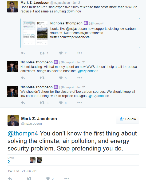
I’ve personally had a similar thing happen to me with Dr. Jacobson – I had a conversation with him on twitter in December of 2015 where I made the argument that we should keep existing low carbon nuclear operating for as long as possible, and at least then, Dr. Jacobson said “There’s an argument to be made for that. Most efficient to replace coal, gas, oil first.“[12] However, during June of 2016, it was announced that Diablo Canyon, a nuclear facility in California, would be shut down, and Dr. Jacobson said people, “Should cheer“[13] for its closure. I sent out a slightly snarky tweet with the juxtaposition of the two statements [14], and Dr. Jacobson claimed (without citing any numbers for the cost of relicensing or building the new sources) that it would be cheaper to build new WWS than to relicense Diablo Canyon [15]. I made the point that closing Diablo Canyon and replacing it with WWS would not actually decrease fossil fuel usage and carbon emissions, a restated the point that he made in December, that we should work on replacing fossil fuels. He responded back saying “You don’t know the first thing about solving the climate, air pollution and energy security problem. Stop pretending you do.” [16] And then he blocked me as well.

Jacobson_you dont know first thing about climate

Figure 1: Dr. Jacobson’s tweets

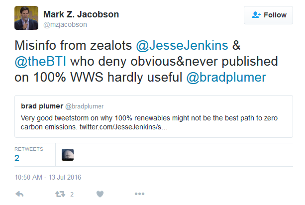
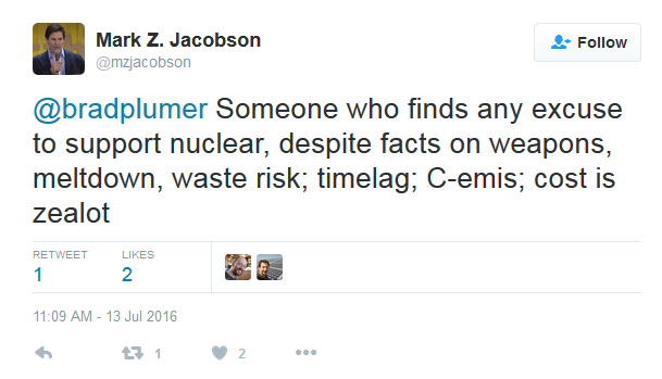
When Dr. Jacobson called Jenkins a zealot, he said (reproduced in Figure 2):
Misinfo from zealots Jesse Jenkins & Breakthrough Institute who deny obvious & never published on 100% WWS hardly useful
Someone who finds any excuse to support nuclear, despite facts on weapons, meltdown, waste risk; timelag; C-emis; cost is zealot

Jacobson_zealot1

Jacobson_zealot2

Figure 2: Dr. Jacobson’s tweets 

The definition of a zealot from Merriam-Webster is, “a person who has very strong feelings about something (such as religion or politics) and who wants other people to have those feelings: a zealous person“. In this context, you could say that someone who chooses to hold a belief despite overwhelming evidence to the contrary, and forcefully promotes that belief is a zealot. I’ve followed Jesse Jenkins work for a while, he does good work, is willing to debate with people about it, is willing to defend his work, and is willing to admit when he’s wrong. Because of this, I don’t think he’s a zealot as Dr. Jacobson claims.

But more to the point, Dr. Jacobson essentially just said that any person who supports nuclear energy is a zealot. As someone who supports nuclear energy and actively does research that can help make it safer, I wholeheartedly reject this assertion. Nuclear energy has its benefits, drawbacks, and risks, just like any other technology. And it’s important to recognize that. But to call that anyone that disagrees with you a “zealot” is a ludicrous statement. Moreover, if anyone who supports nuclear energy is a zealot, then President Obama, Secretary Clinton, many prominent scientists, and even the members of the IPCC would be considered zealots. Surely that’s not what Dr. Jacobson meant, but that is what he said.

And instead of engaging in thoughtful debate with an open mind, Dr. Jacobson ignores criticism and shuts down debates through blocking people. In fact, you can search Dr. Jacobson’s entire twitter feed for the words “wrong” or “mistake”, and in his almost 4000 tweets, he’s never admitted that he’s wrong or that he made a mistake. He’s always saying other people are wrong. According to Dr. Jacobson, the EIA is wrong [17], the IPCC is wrong [18], the Washington Post is wrong [19], Dr. James Hansen is wrong [20], the Breakthrough Institute is wrong [21], Bill Gates is wrong [22], Jesse Jenkins is wrong [23], I’m wrong [24], just to name a few. Dr. Jacobson clearly has a certain set of beliefs, and those beliefs seem to be unshakable, even when the other researchers or the IPCC disagree with him.

It’s my personal opinion that we’ll need both renewables and nuclear, along with policy changes (price on carbon, clean energy standards) and other solutions like demand response, storage, and electric vehicles if we are going to significantly reduce emissions. I don’t know exactly what role nuclear will play in the future, but it is currently playing a large role in many countries (including the US) and will continue to be the largest single source of low carbon energy in the US for many years to come. Prematurely closing this generation will result in higher emissions, something that is becoming all to frequent.

The biggest problem in my opinion is the lack of political will and political action for climate solutions. It is important to debate what the best solutions are. But when Dr. Jacobson purposefully blocks people and calls people names for trying to critique his work or engage him in a dialogue, he is actively fracturing people into two competing “teams”, one team supporting nuclear, the other against it; in reality both sides want the same thing, to solve climate change.

So to anyone reading this, please try to tone down the rhetoric, and really try to understand other people’s views. It’s the only way that we can find some common solutions and move forward, together.

When nuclear is closed in California, what takes its place?

San_Onofre_Nuclear_Power_Plant

What replaced San Onofre?
Nicholas Thompson

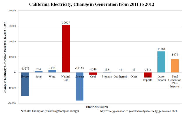
It sounds like a pretty simple question, and the answer is actually pretty simple. To the first order, San Onofre, a low carbon nuclear facility in California that stopped operating in early 2012, was replaced with natural gas generation. Here’s a graph (Figure 1) of the change in electricity generation in California from 2011 to 2012, low carbon sources are colored blue, high carbon sources are red, and “Other imports” is a mix of sources. It’s pretty easy to see that there was a large drop in nuclear generation when San Onofre shut down, and at the same time, there was a drop in generation from hydroelectric dams. These two effects, along with the increase in total demand for electricity in 2012, created a large shortfall, which was primarily filled in by natural gas. There was also a large increase in imports from other states (which is a mix of fossil fuels, renewables, and nuclear).

California Electricity

Figure 1: Electricity Generation Changes from 2011 to 2012

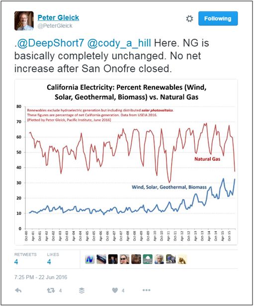
So why do I even bring this up if it’s so obvious? Because there is a belief out there that renewables replaced San Onofre (Figure 2), and that natural gas usage did not increase when San Onofre closed (Figure 3). I don’t want to pick on any one person, but Dr. Peter Gleick has made both of these cases recently. Dr. Gleick is someone I respect very much – he co-founded and is the President of the Pacific Institute and is an expert on water resources and climate change. Here are two of his recent tweets about San Onofre. Now, it’s possible for him to make the argument that all the growth in wind, solar, geothermal, and biomass generation for the entire state of California from 2012-2015 equals the amount of electricity that San Onofre produced, and that’s just about right. But that’s not a reasonable argument – of those sources, biomass and geothermal have been rather constant over that time span, meaning that only solar and wind grew, and both of these sources are intermittent – meaning that much of the time that nuclear would have been producing electricity, solar and wind wouldn’t be. So it’s not fair or accurate to say that renewables “quickly/easily replaced San Onofre”, even today – more on this later.

Gleick_1

Figure 2: Dr. Gleick Tweet 1, renewables “quickly/easily replaced San Onofre.”
https://twitter.com/PeterGleick/status/745753823331835910

Dr. Gleick’s other argument states, “NG [natural gas] basically completely unchanged. No net increase after San Onofre closed.” As was seen before in Figure 1, there was a large increase in natural gas usage, an increase by over 33%. But more importantly, that level of natural gas consumption has stayed rather high ever since – it hasn’t come down as solar and wind have been added to the grid. And if you live in California, the reason is rather obvious – there’s no water. Hydroelectric generation has been decreasing ever since 2011, and 2015 was the worst year in decades for electricity produced by hydro in California.

Gleick_2

Figure 3: Dr. Gleick Tweet 2, “No net increase [in natural gas electricity generation] after San Onofre closed.” https://twitter.com/PeterGleick/status/745759654257385473

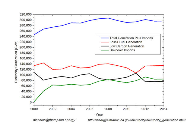
So what’s the net result? As is seen in Figure 4, the loss of San Onofre at the end of 2011, mixed with the low output of hydroelectricity, lead to a significant drop in low carbon generation in California (30,886 GWh or ~29% of low carbon generation lost from 2011 to 2012), and since then, low carbon energy generation has been completely flat. Natural gas generation, which in 2011 was at its lowest point since 1999, shot back up to near record highs, and has not decreased much since then.

TotalGeneration

Figure 4: Low Carbon Generation, Fossil Fuel Generation, and Imported Electricity in California

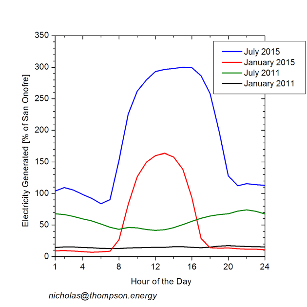
But let’s go back to that last claim, that solar and wind have quickly/easily replaced San Onofre. To really verify this claim, we’d need to go back and see what sources of electricity were operating when San Onofre would have been on an hour by hour basis. Luckily, the California Independent System Operator has this data, available here. All the compiled data can be found here. Solar and wind have both daily fluctuations in generation and seasonal fluctuations, so based on the generation of wind and solar on an hour by hour basis, I calculated the average generation for each hour over each month for 2011 (the last year San Onofre was operating). For example, in Figure 5 (which shows generation as a percent of San Onofre’s generation in 2011 [18107 GWh, Average of 2067 MW]), during the summer of 2011, there was more electricity being generated from wind than solar, so the curve looks pretty flat throughout the “average” day. But by the summer of 2015, a substantial increase in the total solar generation capacity lead to a large increase in electricity generated from solar, giving the plot a peak in the middle of the day.

I then looked at the actual hourly generation for wind and solar for each hour in 2012, and subtracted the expected generation for that month and hour of the day based on the 2011 data to calculated the additional electricity generated from new sources. This allowed me to estimate the additional generation on an hourly basis, and see how much of San Onofre’s generation was actually replaced by wind and solar, each year.

WindSolar

Figure 5: Hourly Average Electricity Generation from Wind and Solar Combined for Select Months

The results? If you look at the data on an hour by hour basis, then there were 3777 hours in 2015 that new wind and solar (added to the grid after 2011) generated more electricity than San Onofre did in 2011. Results on a year by year basis can be seen below in Table 1. And from Figure 5 above, it’s pretty easy to see why – during the summer, solar generates a lot of electricity, but it’s not all generated when San Onofre would have. It’s also important to note that Figure 5 is an average – even in 2015, 8.5% of the time, wind and solar generated less than 10% of what San Onofre would have been generating. And what’s picking up the slack during that 57% of the time that wind and solar aren’t producing enough electricity to replace San Onofre? Natural gas.

Table 1: Number of Hours that Wind and Solar added to the grid after 2011 generated as much or more electricity than San Onofre did in 2011

2012 2013 2014 2015
Hours 73 1740 3485 3777
Percentage 0.88 19.86 39.78 43.12

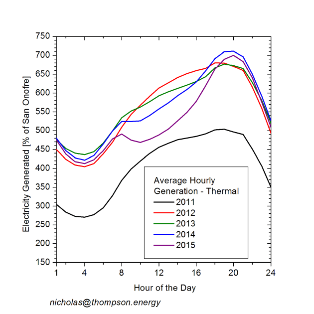
Figure 6 shows average hourly generation from fossil fuels – the California ISO data does not break out natural gas separately, but nearly all the fossil fuel generation in California is natural gas. As explained before, 2012 saw a huge increase in natural gas usage, due to the closure of San Onofre and the decrease in hydroelectric generation. Another interesting feature that can be readily identified is the decrease in the need for fossil fuels during the middle of the day due to the increase in solar generation at that time.

Thermalplot

Figure 6: Average Hourly Generation for Fossil Fuels

By generating the same plot as Table 1 for additional fossil fuels, in Table 2 it can be seen that 74.87% of the time during 2012, additional fossil fuels were completely replacing  San Onofre. This number has come down some, but is still above 50% – meaning more than half the time in 2015, additional fossil fuels generated more electricity than San Onofre.

Table 2: Number of Hours that additional fossil fuels generated as much or more electricity than San Onofre did in 2011

2012 2013 2014 2015
Hours 6272 6501 6112 4871
Percentage 71.60 74.21 69.77 55.61

In summary;

  • San Onofre was primarily replaced by natural gas, this can be demonstrated by looking at raw GWh/year and an hour by hour analysis,
  • The closure of San Onofre coincided with a huge boom in wind and solar, but also a huge drought, so the share of clean energy dropped substantially from 2011 to 2012 and has not changed much since,
  • While solar and wind that have been added to the grid since 2011 now generate more generation than San Onofre did, they do not generate electricity at the same times that San Onofre did, as solar generation peaks during the day; because of this it is not accurate to say that additional wind and solar have replaced San Onofre, even now.

If you liked this article or have any comments, please contact me at nicholas@thompson.energy

Hope you have a great day!