
Introduction
A few months ago I read a paper, “Nuclear energy and path dependence in Europe’s ‘Energy union’: coherence or continued divergence?” and after reading it, I wasn’t sold. Their fundamental idea was that in countries which are looking to build nuclear or replace existing nuclear, emissions are not dropping as fast as emissions in countries which don’t have nuclear or are closing nuclear facilities, and that the changes in emissions were due to “path dependence”, meaning that once a country decides to go nuclear, they get stuck on that path.
The reason I wasn’t sold was there were a lot of words (21 pages), and three pages of references, but only one table that had any real data. That table showed a number of EU countries, how much their emissions had changed from 2005 and 2012, and the share of renewables in 2013 for that country. The change in emissions was presented in terms of percent reduction, without any data on absolute reduction in emissions, or the starting emissions for that country, and the growth of renewable generation also was not presented.
The data was also compared to 2005, which seemed odd considering the paper talked at length about the EU 2020 Strategy (which started in 2010, and uses 1990 as its baseline). It was also strange that in 2016, data from 2012 was being used instead of data from a more recent year.
So I emailed Dr. Sovacool and Dr. Lawrence (two of the authors) the following questions:
1) What time period was used for the emissions reductions? It seems to be 2005-2012, based on the 2015 EU Commission document page 30, but it’s not clear from the paper.
2) Why was 2005 used as the start of the period? The EU 2020 goes from 2010-2020, and the Lisbon Strategy went from 2000-2010.
3) Why are percentages of emissions reductions from countries with vastly different overall emissions averaged? Eg. France is a large energy producer and had significant cuts in emissions, Romania is relatively small in comparison, but both are weighted equally in the average of % emissions change. Why weren’t the total emissions changes for each group added up and then the percentage taken of that? This seems like a more accurate assessment of whether emissions increased or decreased in those groups of countries.
4) Likewise, why were percentages of renewables share averaged? Again, a small country (by energy consumption/population) with a large renewables share (eg. Iceland) has equal weight in this method to much larger country (eg. Italy).
5) Also, shouldn’t this column look at growth in renewables share over the same time period, not overall percentage? There are many European countries who’ve undergone a huge growth in renewable capacity, and a number that already had a large renewables capacity (eg. hydro) before this time period; if the goal is to identify the impacts of the EU 2020 Strategy, then the change in renewables generation would seem to be more valuable information, no?
I did get a response back from Dr. Sovacool, who said that Dr. Lawrence was on vacation, but he’d respond when he got back. And so I waited, and started to forget about the paper. I figure he probably lost track of my email, it happens.
But recently “The Sussex Energy Group” (Dr. Lawrence, Dr. Stirling, and Dr. Sovacool) has responded to a few other criticisms of this paper, and I read one of the responses. In it, they looked back at their data and realized that some of their numbers in the table from their paper were wrong, and they posted corrected numbers. At this point, I decided to do my own analysis, and here it is.
Analysis of Lawrence, Sovacool, & Stirling
Nicholas Thompson
There is a lot to unpack here, so I’ll try to go step by step.
Problem 1: The math is incorrect
Here The Sussex Group states that emissions reduction data was taken from the Statistical Handbook of the European Union, here is a link directly to that data. This data is presented in proportion to 1990 emissions, where 1990 = 100. What The Sussex Group seems to have done is subtracted the 2012 emissions from the 2005 emissions to get a “percent reduction in emissions”. This is incorrect math. To calculate a percent change of anything, you take (New-Original) *100/Original. By not doing this (dividing by the original value), they didn’t calculate percent change in emissions with a 2005 baseline (as the paper states).
To demonstrate, here is the data for two countries:
Table 1: Relative GHG Emissions Data for Spain and Hungary
| 1990 | 1995 | 2000 | 2005 | 2010 | 2011 | 2012 | Subtracting 2012-2005 | Actual Percent Emissions Reduction [%] | |
| Spain | 100 | 110.9 | 134.8 | 154.2 | 125.4 | 126.4 | 122.5 | 31.7 | 20.56 |
| Hungary | 100 | 81.3 | 79.5 | 80.6 | 69 | 67.2 | 63.7 | 16.9 | 20.97 |
Doing all this math correctly creates a different table than the one found here:
Table 2: Sussex Data vs. Calculated Percentage Reductions in Emissions
| Sussex Data | Corrected Percentage Reduction in Emissions | |
| Group 1 Average | 11.80 | 9.67 |
| Austria | 16.00 | 13.33 |
| Cyprus | 1.90 | 1.27 |
| Denmark | 17.50 | 18.54 |
| Estonia | -1.60 | -3.49 |
| Greece | 22.60 | 17.61 |
| Ireland | 20.80 | 16.28 |
| Italy | 21.90 | 19.62 |
| Latvia | -0.40 | -0.94 |
| Luxembourg | 10.80 | 9.97 |
| Malta | -9.50 | -6.45 |
| Portugal | 29.80 | 20.59 |
| Group 2 Average | 13.77 | 12.07 |
| Belgium | 17.80 | 17.73 |
| Germany | 4.30 | 5.32 |
| Netherlands | 8.50 | 8.35 |
| Slovenia | 7.60 | 6.90 |
| Spain | 31.70 | 20.56 |
| Sweden | 12.70 | 13.60 |
| Group 3 Average | 10.19 | 12.92 |
| Bulgaria | 2.30 | 3.95 |
| Czech Republic | 7.10 | 9.54 |
| Finland | 9.90 | 10.10 |
| France | 12.10 | 11.91 |
| Hungary | 16.90 | 20.97 |
| Romania | 9.90 | 17.10 |
| Slovakia | 12.20 | 17.28 |
| UK | 11.10 | 12.53 |
| Group 4 Average | 1.50 | 3.32 |
| Lithuania | 3.40 | 7.11 |
| Poland | -0.40 | -0.47 |
In The Sussex Group’s analysis, they split countries into four Groups:
Group 1: No Nuclear
Group 2: Decommissioned/Phasing Out Nuclear
Group 3: Plans to Extend/Replace/Add Nuclear
Group 4: Plans to Resume Nuclear
First note on this is even using their incorrect subtraction method, The Sussex Group data for Sweden and Latvia here is incorrect. The second note is that when using their premise and actually calculating the average percentage change in emissions correctly, their entire thesis is incorrect. It shows that countries with no nuclear had lower emissions reductions than countries which were decommissioning nuclear, and the greatest emissions reductions were in countries which were extending/replacing/adding nuclear.
Problem 2: The method is incorrect
So far, for the sake of argument, I’ve been assuming that method their analysis is correct – and it isn’t. Just averaging emissions changes in countries does not tell you much about the emissions changes in that group of countries, because each country has a different amount of emissions, and some of these countries are vastly different. Averaging a percentage change in emissions in Malta and Italy is meaningless – one has over a hundred times more emissions than the other. Taking a simple average weights these two countries the same, as if they are the same size.
Just to give an example, from 2005 to 2014, Italy reduced its emissions 27.2%, and over the same time period, Malta increased its emissions 2.1%. An average of these two would yield a 12.55% “decrease” in emissions – which is completely wrong! In absolute terms, Malta’s emissions increased 0.1 million tons of CO2-eq, and Italy’s emissions decreased by 160 million tons of CO2-eq. The proper way to calculate percent emissions reductions would be by summing the total emissions reductions for both countries over the time period desired, and dividing by the starting emissions of both countries (and multiplying by 100).
Problem 3: There is no justification for their starting year of analysis
Whenever anyone analyzes anything, the baseline they use is extremely important, and can influence the results. To demonstrate that, I’ve calculated and plotted in Figure 1 the actual percent emissions reductions for each of the 4 Groups that The Sussex Group looked at, as a function of the starting year, with 2014 being the end point. So for instance, on the graph, year 1995 is plotting the percentage emissions reductions for that group from 1995 to 2014. Data is from Eurostat here and here.
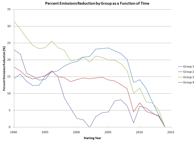
Figure 1: Percent Emissions Reductions by Group as a Function of Time
Just for a reminder:
Group 1: No Nuclear
Group 2: Decommissioned/Phasing Out Nuclear
Group 3: Plans to Extend/Replace/Add Nuclear
Group 4: Plans to Resume Nuclear
As the graph shows, with a starting year from 1990 to just after 2000, Group 3 had the most emissions reductions. Using a starting year after that, Group 1 had the most emissions reductions, but was closely followed by Group 3. This shows again, that their conclusion is not supported by the data. But that’s not all.
The paper also makes many references to the EU 2020 targets – which aim to decrease emissions 20% lower than 1990 levels. Based on that goal, it’s clear that 2005 should not be the baseline year, 1990 should. Meaning it’s countries in Groups 1 and 2 which have more work to do to decrease emissions, the countries which do not have nuclear or are decommissioning/phasing out nuclear.
Problem 4: Statistical significance
One of the groups shown here (Group 4) has only two countries, meaning there is likely little statistical significance from this group and no conclusions should be drawn from it. Normally samples are only statistically significant if there are 30 or more observations, which when it comes to countries is sometimes impossible. However the conclusions derived from the analysis in the paper don’t seem to address this limitation of this data.
Problem 5: There’s no attempt to account for population
Normally when comparing the carbon emissions of various countries, the total emissions are put in some context by putting them in terms of per capita emissions. I’ve done that here, for each Group (data here). Group per capita emissions data was calculated by summing the total emissions in each Group and dividing by the total population of each Group. As can be seen in the graph, Group 2 has the highest emissions to start with, followed by Group 1, 3, and 4. As time goes on, per capita emissions in Groups 1, 2, and 3 all drop, with emission for Groups 1 and 3 ending up almost exactly the same in 2014.

Figure 2: Per Capita Emissions by Group
Conclusion
The paper states the following,
“Perhaps most germane – and without necessarily implying causality – there appears to be a prima facie pattern among the disaggregated groups of countries presented above: namely, progress in both carbon emissions reduction and in adoption of renewables appears to be inversely related to the strength of continuing nuclear commitments.”
In the “Policy Relevance” section, the authors write that this article,
“…finds that intensities of national commitment to nuclear power tend to be inversely related to degrees of success in achieving EU climate policy goals.”
None of the data seem to support these conclusions, and the entire paper is based on those conclusions. If anything, countries with nuclear energy tend to have started with lower emissions per capita, and achieved more emissions reductions in percentage terms.
This is actually unsurprising when the data is examined. Many of the Group 3 countries are former Soviet states which were able to close older, dirtier power plants, and the two largest Group 3 countries (France and the United Kingdom) both have seen large reductions in emissions since 1990. All of the Group 3 countries but Finland and France have achieved 20% or more reductions in emissions since 1990, and both Finland and France are well positioned to hit these goals by 2020 as they have already reduced emissions ~15%. Compare that to Group 1, where only three out of 11 countries have reduced emissions by 20%, and four have increased emissions since 1990.
It’s very strange that the authors didn’t just go straight to the actual emissions data (per capita or otherwise) which is readily available online, and calculate emissions changes based on that. Instead, by using relative data incorrectly, they came to an incorrect conclusion.
In short, this paper looks more like there was a preformed conclusion, and data was found to fit that conclusion. The math, method used for calculation, and entire premise of the analysis are all wrong. If I have enough time, I’ll write this up more formally as a response in Climate Policy.

,_1990_-_2014_(million_tonnes_of_CO2_equivalents)_updated.png)
This is very good work! One addition worth mentioning is that EU emissions strategy actually allows poorer countries increase their emissions to some extent, so it’s very odd to accuse nuclear policy being the reason for the increase.
But it seems the authors have chosen their sides and hope to push a deeply ideological agenda as science. Very regrettable.
LikeLiked by 2 people
Forgot to add that you DEFINITELY should write this up for Climate Policy. If you need help, let me know.
LikeLike
Pingback: A Response to Lawrence, Sovacool, and Stirling. | The unpublished notebooks of J. M. Korhonen
I agree. This analysis could use some wordsmithing to reduce the use of first person and to formalize the math corrections but the meat of this analysis cuts through the paper’s bullshit. It The sheer scale of the changes to the table already made without any retraction of initial conclusions could also be mentioned.
LikeLike
Nick,
“If I have time…”
Please, please do!!! I had to put this one on the “so patently, obviously awful that I can’t even” pile. I am hugely grateful that you, in fact, did!
This is a very well prepared critique of a paper that was totally, utterly awful.
Well done.
LikeLiked by 1 person
The exact same data also shows that renewables are ineffective at reducing emissions too. https://imgur.com/a/KF9dT
LikeLike
Great work, little chance the authors will respond honourably. Sovacool once published a study which came to the conclusion that nuclear power plants killed more birds than wind turbines – modelled on obscure occurrences.
Just a typo: “It shows that countries with no nuclear had lower emissions reductions [that] than countries which were decommissioning nuclear, and the greatest emissions reductions were in countries which were extending/replacing/adding nuclear.”
LikeLike
Far better than my blog of 18 points which I mistakenly called a refutation when it wasn’t. The publisher says they will write a “corrigendum to correct the errors in Table 2 and in portions of the running text”. That will be hilarious. I can’t see how their article will ever make sense.
LikeLike
A useful measure might be % change in CO2/GDP compared to EU average for a baseline year. This would keep activist researchers from exploiting reduction of economic activity due to the Great Recession.
LikeLike
When corrections to a paper give you the opposite conclusion, there’s something wrong with peer review 🙂 Nice work, Nick!
LikeLiked by 1 person
In this case the editors of the journal ignored at least one peer review advice.
LikeLike
For what it is worth, my own analysis which I think accords with yours but may have a few other points of interest.
As you note, the data are very suspect – for example the EU’s official data (http://ec.europa.eu/eurostat/statistics-explained/index.php/File:Total_greenhouse_gas_emissions_by_countries_(including_international_aviation_and_indirect_CO2,_excluding_LULUCF),_1990_-_2014_(million_tonnes_of_CO2_equivalents)_updated.png) bear no resemblance to those used in the SPRU study – Bulgaria’s total greenhouse gas emissions actually fell by 12.3% between 2005 and 2014 but SPRU claims they rose by 20% and so on;
Sweden has a very clear nuclear replacement policy so its 17.8% emission reduction achievement should actually be included in Group 3 (http://www.nucnet.org/all-the-news/2016/06/13/sweden-could-build-10-new-reactors-after-major-change-to-policy-on-nuclear);
recalculating on the basis of the latest EU data and reallocating Sweden to its proper place gives the overall reduction in the EU-28 between 2005 and 2014 as 17.4%. Non-nuclear countries did best with a reduction of 23.5%. However, this figure is dominated by the 26.7% reduction in the two biggest economies in this group, Italy and Greece, owing to the Eurozone crisis in those countries – these were the only two EU economies actually to shrink between 2004 and 2014 – see http://ec.europa.eu/eurostat/tgm/refreshTableAction.do?tab=table&plugin=1&pcode=tec00115&language=en), So unless the authors are actually arguing that being non-nuclear severely dents a nation’s economic growth it is completely disingenuous to draw any conclusions from this group about a causative relationship between being non-nuclear and cutting greenhouse gas emissions. The non-nuclears are closely followed by those which are defined by SPRU as ‘extend, replace or add nuclear’, at 19.9% reduction, while those with alleged phase-out policies are much worse at 11.5% (since Germany’s emissions rose between 2010 and 2014 owing to their partial withdrawal from nuclear) and the two in Group 4 – which should surely be in the ‘non-nuclear’ group’ – posted reductions of 4.4%;
taking 2010 and 2014 as the key years – which makes more sense as it reflects the effects of post-Fukushima policies of phase-out more sharply – the phase-out group (3) achieved a reduction of just 4.3% against the EU-28 as a whole’s reduction of 10.1% and the ‘extend, add or replace’ group’s 15.8%;
in any case many of the countries described as ‘all NPPs to be decommissioned’ have not held this policy consistently since 2005 (indeed I don’t believe any has) yet the paper takes 2005 as its start date – clearly either these countries should have been excluded from Group 2 or the date of the adoption of their phase-out policy should have been taken as baseline (which would make a huge difference to the results – for example, Germany’s emissions rose between 2010 and 2014).
I do not know which data SPRU chose to use rather than the official EU data (which must be taken as canonical surely) but the conclusions are clear – since Fukushima the data show unequivocally that countries intending to phase out nuclear have done much worse in terms of greenhouse gas emission reductions than those which have had their attention diverted away to nuclear phase-out. In particular they show how disastrous a implemented nuclear phase-out policy is for greenhouse gas emissions. As usual with Sovacool the data create exactly the opposite conclusion to the one that he draws.
LikeLiked by 1 person
This is an excellent analysis! I agree with others who say you should write it up as a comment – though be under no illusions, it can be very difficult to get comments published.
You make one point, however, that I’d like to discuss further. You write:
I think that depends on what you want to learn from the average. If you want to measure ‘effort,’ then presumably it takes as much effort for Malta to decrease its emissions by 10% as for Italy to do the same. Therefore I believe that you should average the percentages, weighting countries equally. This has the effect of (approximately) allowing for population differences. If you take the percentage of the totals, the number is dominated by the countries with the largest emissions, and we learn nothing about the efforts of small countries. If you are trying to measure the effects of policies on emissions I think you need to look at each country individually.
LikeLike
I spoke to Andy Stirling about this last Saturday and he said ‘the paper was rubbish and we’ve withdrawn it’ (though the press release is still on the SPRU website). It is very revealing of the antinuclear stance of places like SPRU – if they were genuinely wishing to make a fact-based contribution to the debate rather than to justify a preconception they would not seek to withdraw the paper, they would do all they could to make sure that people realised that going non-nuclear is a disastrous policy from the climate’s point of view. But of course that doesn’t fit the ideology so cannot be pursued.
LikeLiked by 2 people
Perhaps a chance for you and/or Nicholas to write it up properly!
LikeLike
One other point, the ‘non-nuclear’ group is dominated by Italy and Greece, the only two EU economies to have shrunk since 2004. This is obviously a much more likely explanation of their significant reductions in greenhouse gas emissions than anything to do with nuclear policy, even ignoring that Italy had a pro-nuclear governmental stance from about 2007 until after Fukushima. Excluding these two unique economies puts the non-nuclear group well behind the replace or expand group in terms of greenhouse gas emission reduction.
LikeLike
The only reason I noticed their study is because two 100%-RE propaganda websites turned their press release into a news report. Without the press release, it would’ve passed under my radar. Maybe passed under all our radar, apart from those who must read ‘Energy Policy’ journal.
LikeLike
By the way, any thoughts about how this got through the refereeing process if all of us using publicly available data could demolish it in a couple of hours?
LikeLike
Pingback: Response from Lawrence, Sovacool, and Stirling and Statement of Article Withdrawal | Nicholas Thompson
Pingback: Advocacy by Fact-Checking. This can work | Meredith Angwin | Author & Nuclear Energy Advocacy Consultant
Pingback: Advocacy by Fact-Checking. This can work. | Meredith Angwin